One example of how this extra specificity can render evolution falsifiable is given by the notion of common descent. Common descent is not falsifiable in the general case - you can never be sure that any new species can't be fitted somewhere on the family tree. However, one prediction that can be derived by considering this concept in specific cases is: the phylogenetic tree of any set of organisms is fixed.
Say we choose four organisms, then consider ten genes that occur in all of them. For each of these genes we can draw a graph or network of how the organisms appear to relate (more on how to do this later). If those graphs are not equivalent, that indicates that the family tree is not the same for each gene. This would falsify common descent.
With this approach in mind, I present a step-by-step HowTo guide to falsifying evolution.
Step 1: Pick two or more genes
It turns out that it's generally easier to pick a couple of genes first and see which species their sequences are available for than to pick a couple of species and try to identify genes they have in common.
If you're after a list of genes to consider, why not spend some time sticking random searches in the NCBI's Entrez Gene database frontend?
For this example, I have chosen the genes HoxA5 and HoxB5. No particular reason; I'd just heard hox genes referred to before.
Step 2: Pick four or more species
If you pick fewer than four species, it is impossible for the graphs to be distinct - three points can only be connected up in one way. With four species, you have at least two ways (see below). More species would be interesting, but let's keep it simple.
To confirm that your genes are available for the species you're interested in, go to the NCBI's Homologene site and type your gene's name into the search bar.
For this example, I'll be considering homo sapiens (humans), pan troglodytes (chimpanzees), mus musculus (mice) and rattus norvegicus (rats). This is because these species are all available for the genes I'm interested in.
Step 3: Determine the distance between the species' genes
For each gene, and for each pair of species, you need to determine the extent of the difference between the exact forms of the gene in each species. This can be thought of as a measure of distance - two variants of the same gene will be separated by a given number of mutations.
The easiest way to do this is to cheat and use NCBI functionality again. In the case of HoxA5, for example, I would go to its HomoloGene page and click on the link titled "Show table of pairwise scores". This brings up a table of alignment scores - we're interested in the "d" (distance) values.
Step 4: Create a phylogenetic graph for each gene
We now have enough information to use a technique called the nearest-neighbours algorithm to derive a phylogenetic graph. A phylogenetic graph is basically a family tree of the species, except without any indication of where the last common ancestor fits into the picture. They look something like this, only without the "X marks the spot" in the middle.
The advantage of a phylogenetic graph rather than a tree is that it is actually impossible to figure out which part of the tree is the "root" from theoretical techniques alone. An unrooted tree, a phylogenetic graph, is therefore used instead. These are quite easy to generate from bioinformatic data. The easiest algorithm, and the one we're using here, is called the Nearest Neighbour algorithm. There are more reliable algorithms, but this one is handy because we only need to worry about the distance between gene variants rather than their actual encoded content.
To produce the graph, you can use an online tool like this one - just fill in the distance data from HomoloGene. This particular tool produces a number of trees, which all represent the same graph with differently-positioned roots. You'll need to figure out what the original graph looks like. For example, this tree:
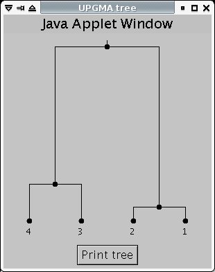
is structurally equivalent to this graph:
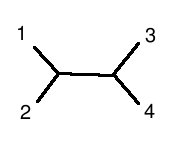
(note: 1 is human, 2 is chimp, 3 is mouse, 4 is rat)
Step 5: Compare the phylogenetic graphs
If you find, as I did, that the two genes you have chosen give phylogenetic graphs that are precisely equivalent, tough luck: you've failed to disprove evolution. In fact, you've actually reinforced it slightly - in the absence of some variant of evolutionary biology, there is absolutely no reason to expect this law of phylogenetic graph equivalence to hold.
It is certainly not characteristic of any designed system. If you ran this test on computer code, on engineering designs, on literature you'd continually find situations where it didn't hold - chimaeras that built on many existing traditions rather than just the one. If the living world was indeed designed by an intelligent, purposeful entity then He must have gone out of His way to give the impression that evolution was responsible.
If you find that the two genes give phylogenetic graphs that are not equivalent, congratulations: you may have falsified evolution. If you've pulled off this trick, I would ask that you list the genes you used in the comments section of this post, so I can confirm your results. If there are no mistakes in your working, we can try some more accurate phylogenetic graphing algorithms, and if the results are still positive then quite frankly you're looking at a Nobel Prize here.
Good luck!
Read the full post